Short Video
Summary & Mockups
The problem
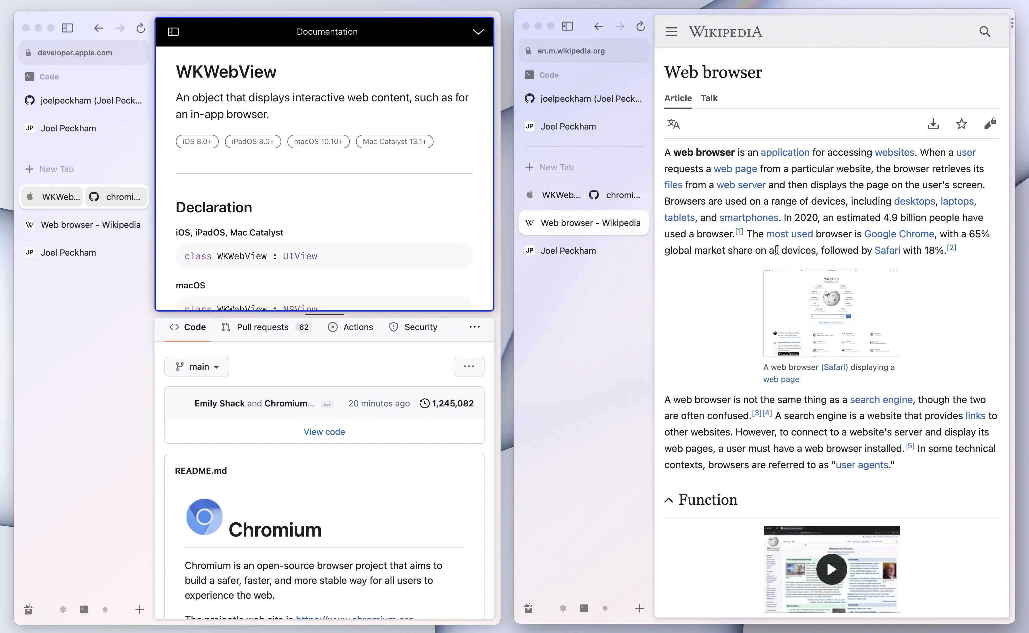
Currently, it can be hard to tell if an Arc window is the “Key” or “Focused” window. The problem is worst when the user has a light desktop background and uses a light color scheme for their Arc Space.
Consider the two windows below; the user must pixel peep to tell which one is the Key window.

The solution
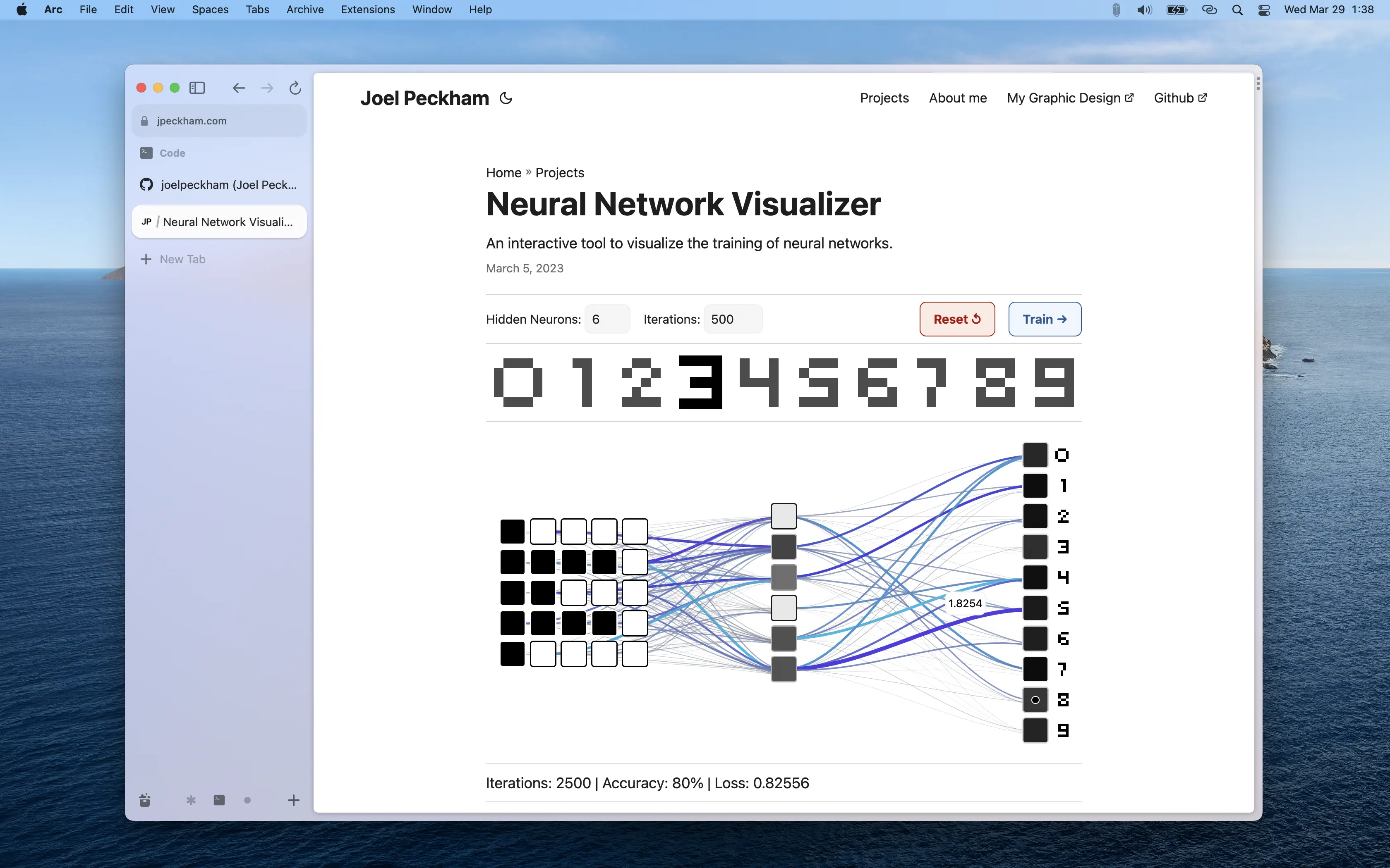
There are lots of possible ways to add visual contrast between the key and inactive windows. However, I think an easy solution is to bring back color to the “Traffic Light” buttons when the window is focused. Apple’s Human Interface Guidelines don’t make this rule explicit, but in my experience, most apps follow it.
Here’s a mockup of what the Arc window would look like with the “Traffic Light” buttons colored when the window is focused.

What about when the sidebar is hidden?
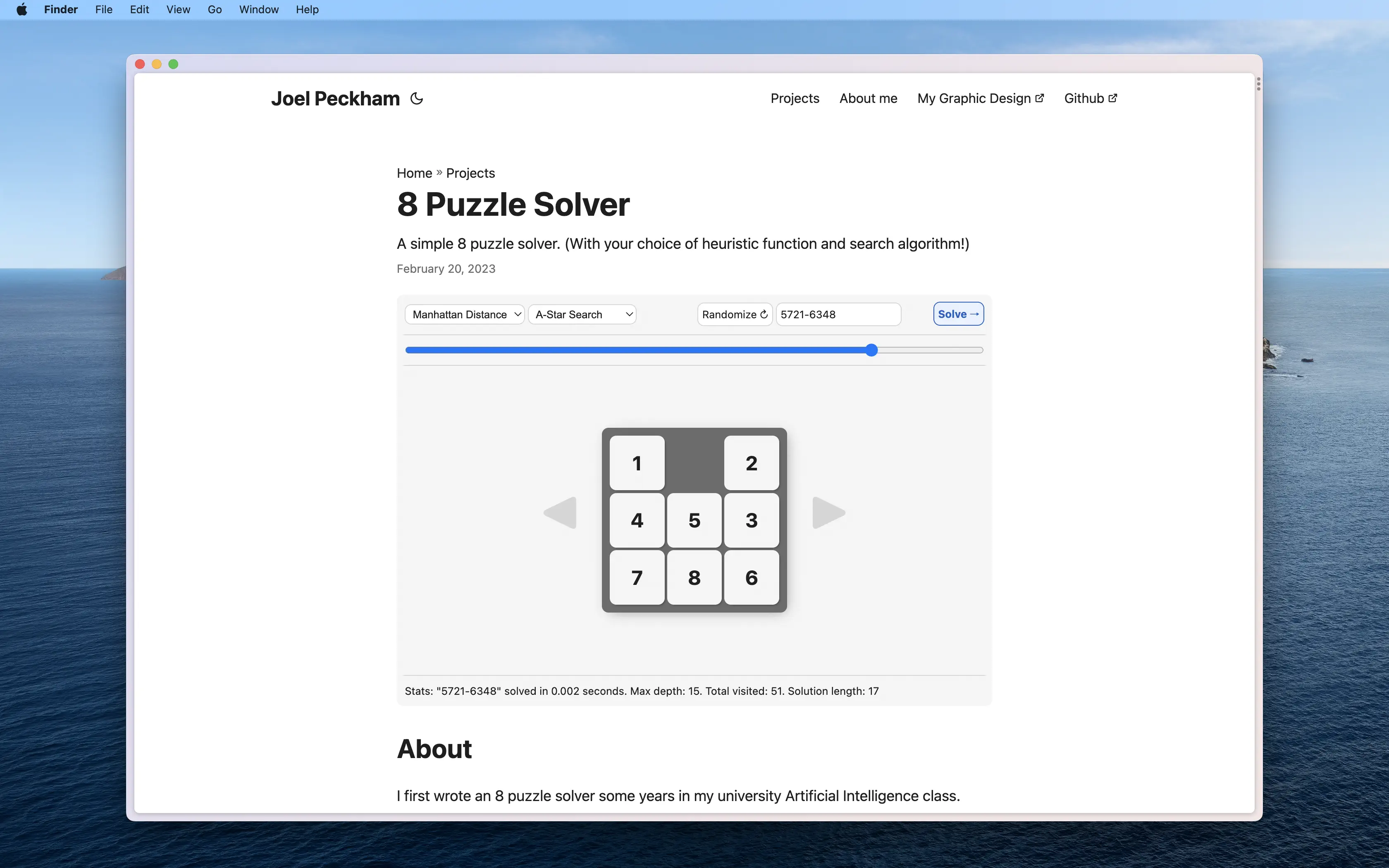
The issue of visual contrast is even more pronounced when the sidebar is hidden. Additionally, the user must use a keyboard shortcut to close the window. Both these issues might be fixed by adding a thin header to the window when the sidebar is hidden. The header would contain the “Traffic Light” buttons and nothing else.
Here’s a rough mockup. In retrospect, I think the header should be a bit taller.

Some cheeky self-promotion
Hello! I’d love to work for The Browser Company! I’ve already submitted a job application and would love to hear back from you. I’m keen on any position, even if probationary or part-time. In the meantime, you’re on my personal website, so why not look around?
Cheers and best wishes to all who read this,
Joel Peckham